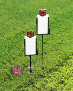
As everyone knows, there’s value in presentation. Today’s blog post is to show how to tie in colors and logo for a consistent look.
“The details are in everything that we touch..”
-Frenchman’s Reserve
- 18-hole, 6,855-yard, par-72 Arnold Palmer Signature Golf Course in South Florida is complete with a driving range, 2 putting greens and a chipping area.
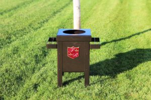
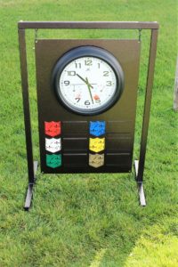
We kept the main color as copper vein, which is a 2 toned warm coppery brown speckled with black. We stayed true to their burgundy/gold/white logo colors.
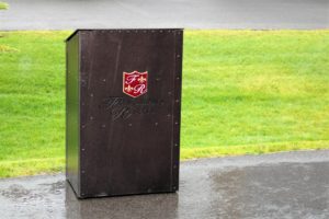
To begin, we built a slanted topped starter’s podium with top and back storage.
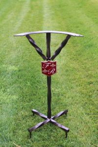
The upright twisted bag stands have holes drilled for alignment rods. The base has prongs to insert in the ground for extra stability.
Next, are the range dividers and club washers that tie in nice with their bag stands.
On their driving range sign, we did 2 columns of yardage for a wider/shorter look.
For the broken tee boxes & trash can enclosures, Frenchman’s Reserve chose to skip the logo, but keep the same color theme.
On the golf instruction signs we kept it subtle in size and then went crest only on the back.
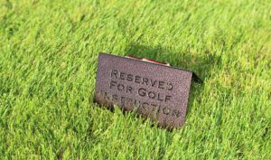
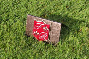
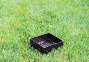
The RHI crew went simple/classy on the sand & seed racks.
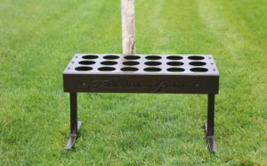
The crew made a sand box with full logo because we had the room on the unit, and it gave variety to logos among the other items.
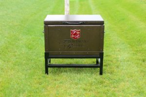
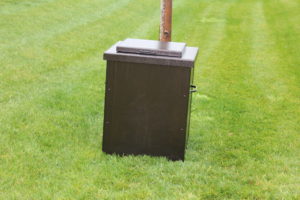
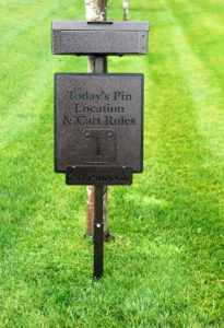
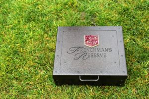
Next, is their scorecard box with post and attached pin location sign. Here’s 2 photos of this piece. I took the box off of the post because I’m not tall enough to take a photo of the top of the box..
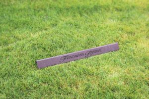
On their in-ground yardage markers, we skipped the yardage and went logo only.
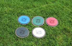
Last to share are their proximity markers and tee box announcements.
